Design System 0→1
Designed a tokenized system from scratch, improving consistency across products and supporting scalable implementation through Storybook.
(AI-Assisted · Storybook · WCAG 2.2 AA)
Client: Cloudticity
Role: Sole Product Designer (Contract)
Tools: Figma, Claude AI, Figma MCP, Stark, Able, Figma Variables, Notion
context

As the sole product designer at Cloudticity, I built a design system from scratch to support three product silos: Oxygen, Nitrogen, and Oxygen AI. Establishing a scalable foundation was critical for complex, data-heavy workflows.
The platform had been built primarily by backend engineers and lacked any formal design system or shared UI foundation. As a result, patterns varied significantly across features, leading to inconsistencies, duplicated work, and a fragmented user experience.
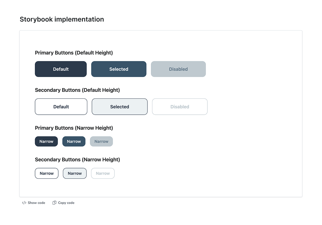
To address this, I designed and implemented a design system from the ground up, creating a scalable foundation for consistency, speed, and long-term product growth. I also integrated reusable React components with Tailwind CSS into Storybook to support documentation, testing, and implementation consistency across teams.
Main pain points
❌ UI patterns varied across product areas, creating an inconsistent user experience
❌ Teams rebuilt similar components repeatedly, slowing down development
❌ There was no shared language between design and engineering
❌ Scaling new features introduced more inconsistency over time
My role
As the sole product designer, I led the design and implementation of the system end-to-end, defining its foundations, building reusable components, and applying it across the product.
I worked closely with product and engineering to ensure the system was not only well-designed, but also practical, scalable, and consistently implemented across multiple product areas.
✅ Audited the existing product to identify inconsistencies
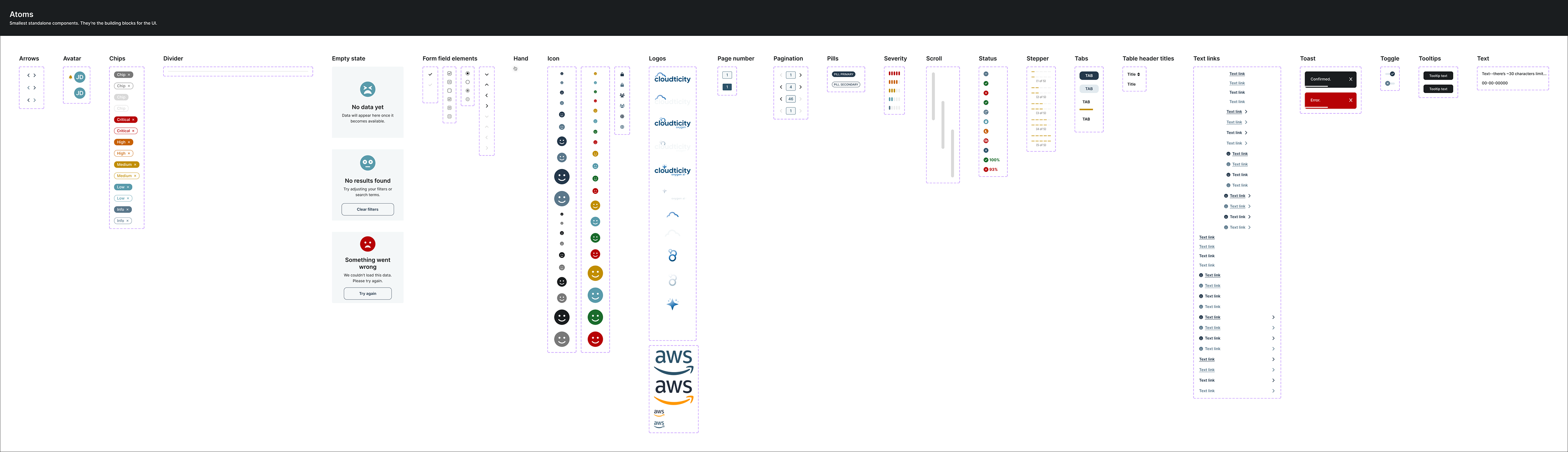
✅ Defined design foundations (tokens, typography, color, spacing)
✅ Designed reusable components and patterns
✅ Applied the system across real product workflows
✅ Integrated reusable React components into Storybook
✅ Collaborated with engineering to ensure consistency in implementation
System evolution with AI
As the system evolved, I revisited and refined it using AI as part of my workflow — stress-testing components, exploring edge cases, and validating consistency across different use cases. This iterative approach helped ensure the system remained robust, flexible, and scalable as the product continued to grow.
Approach:
Building a scalable design foundation
Building a scalable design foundation

1. Audited inconsistencies and defined structure
I started by auditing the existing product to identify inconsistencies in UI patterns, components, and interactions across different product areas.
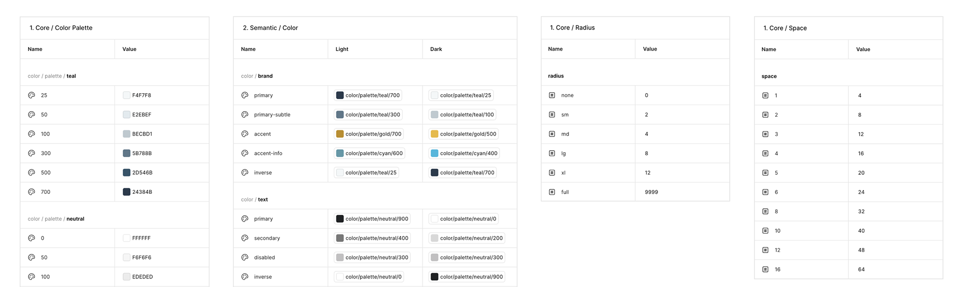
2. Established foundational, tokens
To create a consistent and scalable foundation, I defined a system of design tokens covering typography, color, spacing, and layout.
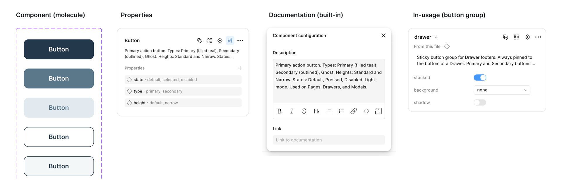
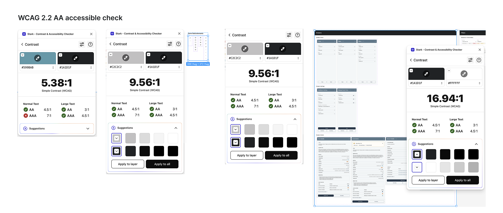
3. Developed reusable, WCAG 2.2 AA accessible components integrated into Storybook
I designed a library of reusable components to standardize patterns and reduce duplication across the platform. AI-assisted exploration helped stress-test components across different scenarios, ensuring flexibility and consistency as the system scaled.
Accessibility was built into the system foundations, ensuring color contrast, typography, and components met accessibility standards from the start.
Reusable React components with Tailwind CSS were also integrated into Storybook to support shared documentation, testing, and implementation consistency between design and engineering.
4. Standardized and consolidated components
As the system evolved, I consolidated overlapping components and standardized patterns to reduce duplication and improve consistency.
I used AI to explore edge cases, validate component behavior, and accelerate iteration, helping ensure the system held up across a wide range of use cases.
State = for interactive states (hover, selected, disabled, default)
Status = reserved exclusively for data/domain values (compliant, suppressed, in progress)
Mode = removed from all components — handled by variable modes instead
Naming hierarchy standardized: Component / context / variant
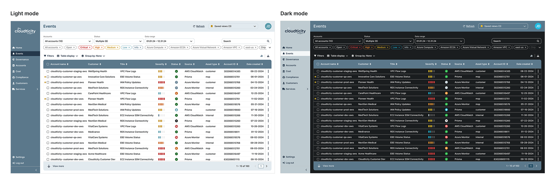
5. Applied the system across product workflows
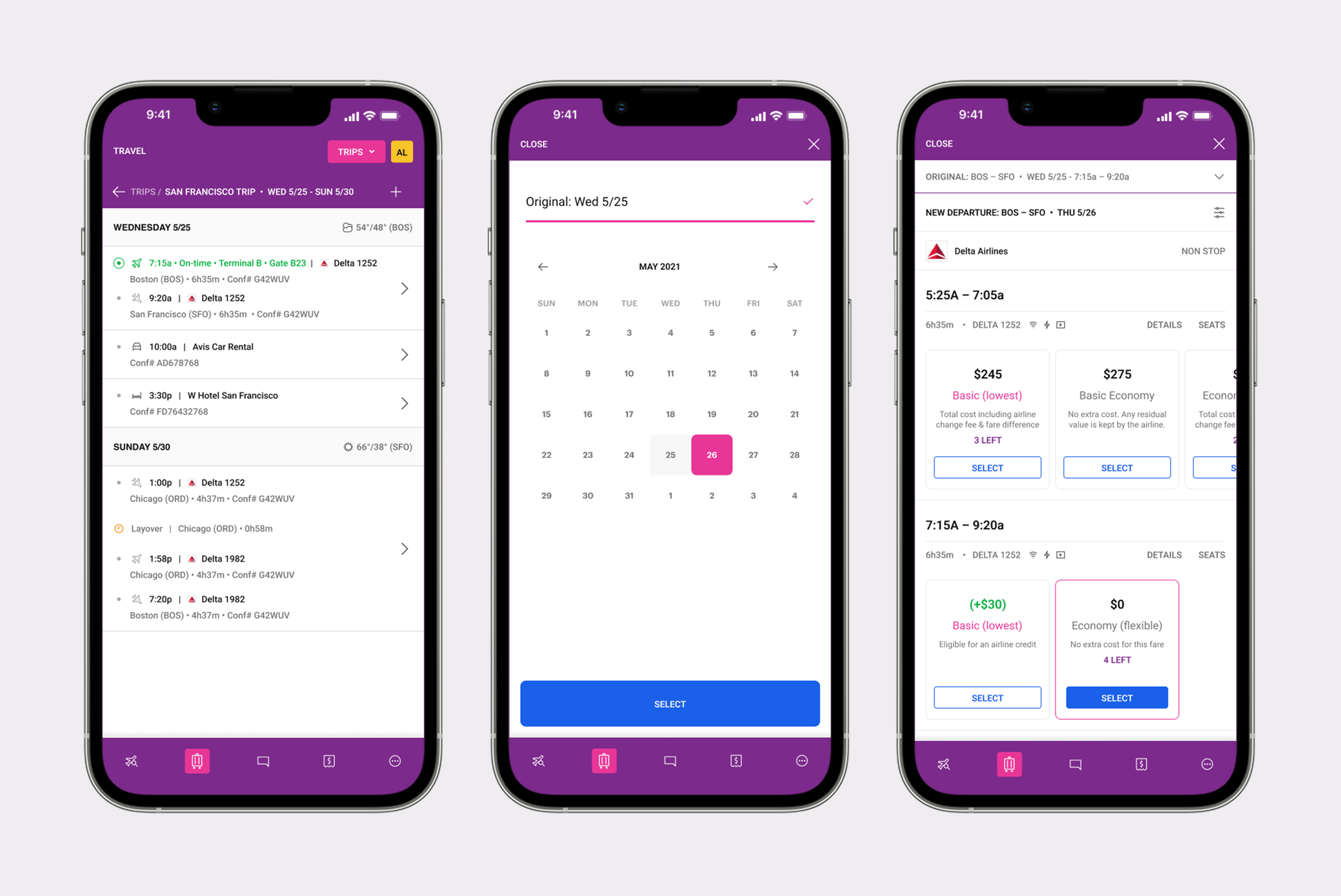
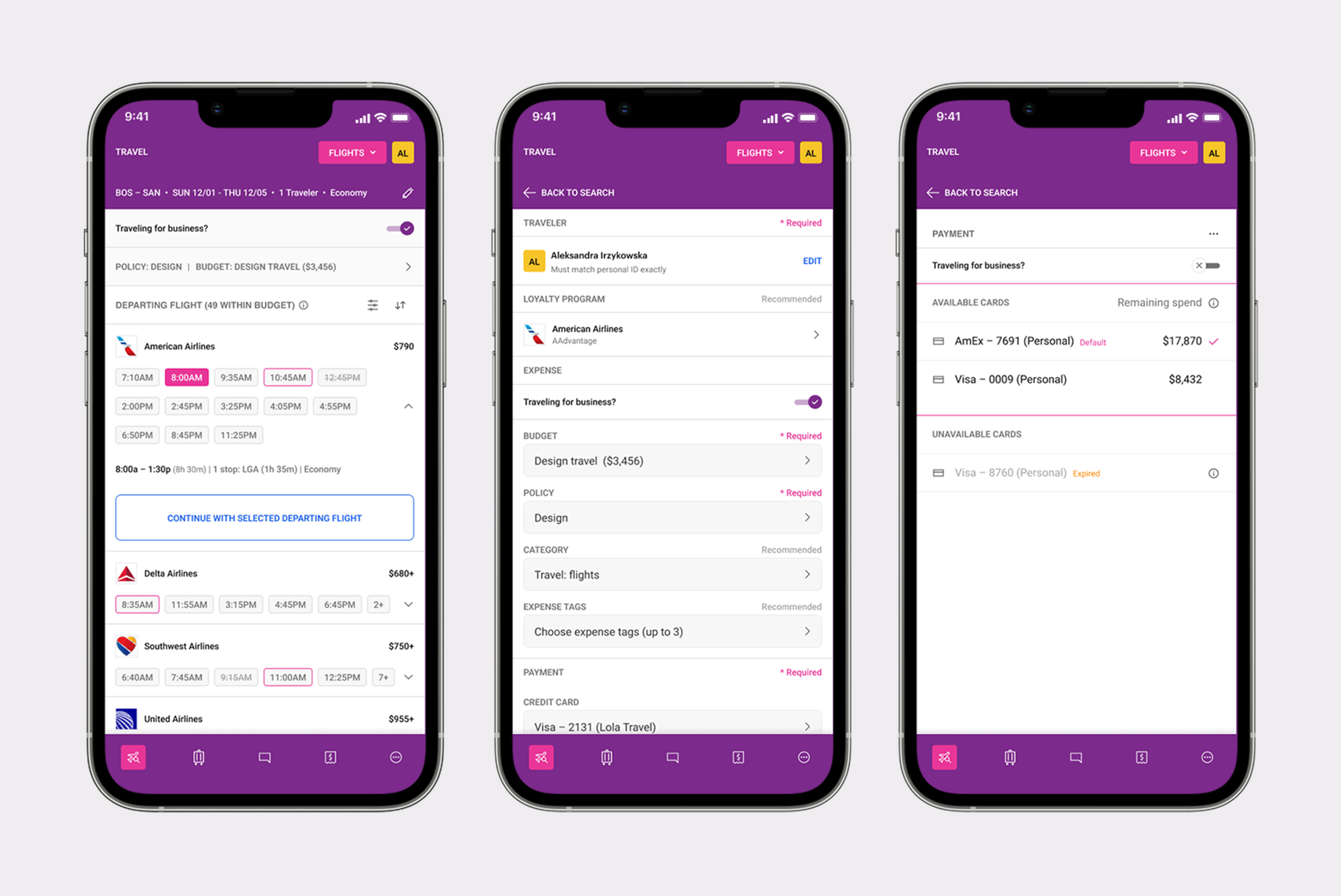
The system was applied across multiple product areas, ensuring consistency while supporting complex, data-heavy workflows.
6. Enabled adoption and scalability
I worked closely with product and engineering to integrate the system into real workflows, ensuring it was adopted and used consistently across product areas.
Outcome & Impact

The design system established a scalable foundation for the product, improving consistency, efficiency, and collaboration across teams.
Key outcomes
✔️ Standardized UI patterns across previously fragmented product areas
✔️ Reduced duplication in design and engineering workflows
✔️ Faster development of new features using reusable components
✔️ Improved consistency and usability across the platform
✔️ A scalable foundation supporting future product growth
✔️ Improved design-to-development consistency through shared Storybook documentation
Reflections & Growth

This project highlighted the importance of establishing structure early when working on complex, evolving products. Building a design system from scratch reinforced how foundational systems thinking is — not just for consistency, but for enabling teams to move faster and scale effectively.
It also shaped how I approach complex products, focusing first on structure and systems before layering in visual and interaction detail, while ensuring design decisions can scale consistently across implementation and development workflows.