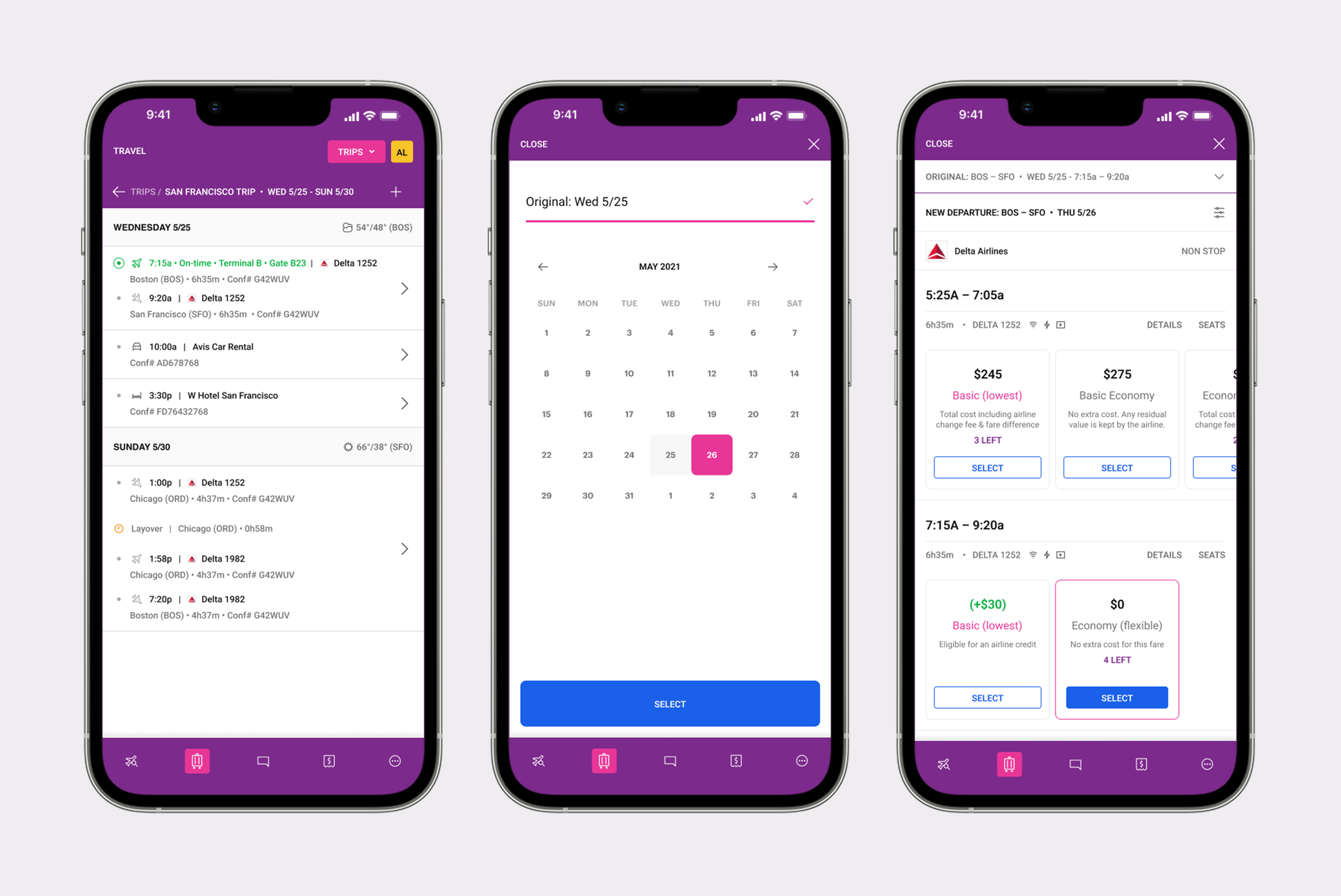
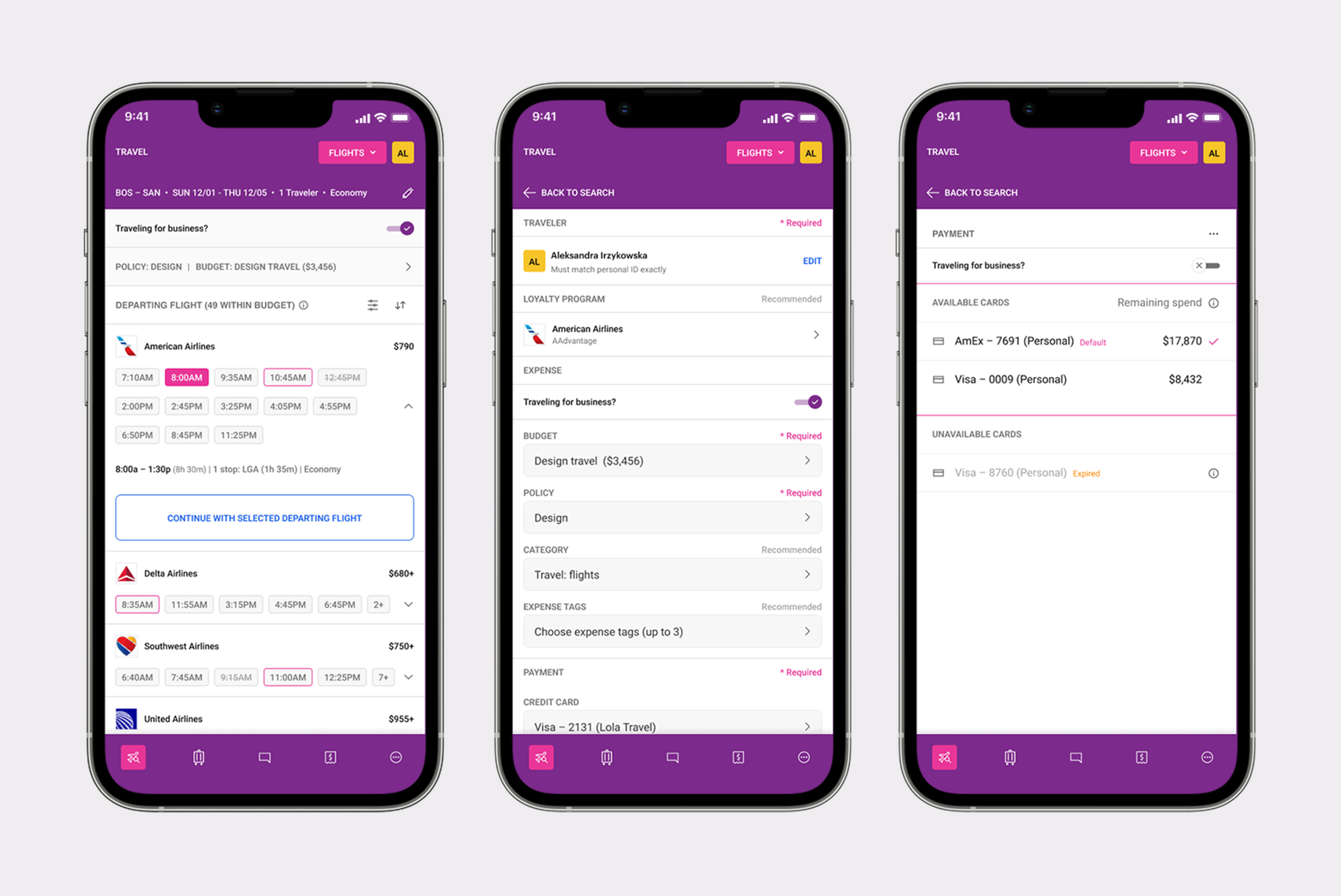
cart editing feature
Cart editing feature, allowing travelers to modify bookings (passenger counts and dates) without abandoning and restarting the booking flow.
(Native Mobile · B2C · Travel)
Client: TripAdvisor
Role: UX/UI Designer
Platform: iOS & Android
To comply with my non-disclosure agreement, I’ve omitted confidential information. The data featured here is my own and does not reflect TripAdvisor’s views.
context

TripAdvisor’s attractions shopping cart plays a pivotal role in the user journey, enabling travelers to plan and book experiences with ease. However, it lacked the ability for users to edit selections — such as changing dates or group sizes — directly in the cart. This created friction that led to user frustration, increased cart abandonment, and lost revenue.
With user behavior shifting toward more spontaneous and last-minute changes, especially on mobile, it was essential to offer a flexible and intuitive way to modify attraction details post-selection. Our goal was to improve user satisfaction, increase purchase completion, and reduce cart abandonment across platforms.
My role
As the lead UX/UI designer, I owned the design process from start to finish. This involved deep user research to uncover pain points, designing wireframes and prototypes, and working closely with product managers, engineers, and the research team. My focus was to ensure that the design was both user-centric and technically feasible. My leadership ensured the collaboration between teams was seamless, resulting in a user experience that not only solved problems but also delighted users.
problem space

The existing experience offered no cart editing capability. If a traveler or manager needed to change any detail after adding items to their cart, the only option was to clear everything and restart. This led to high abandonment rates, frustrated users, and an inflated support queue of requests to "fix" bookings after the fact.
Key problems to solve:
• Lack of ability to edit attraction details directly within the shopping cart.
• Users had to remove and re-add items to make simple changes.
• Common adjustments like date changes, group size (PAX-mix), and tour grade selections were unnecessarily complex.
• The process was time-consuming and disrupted the booking flow.
• Lack of flexibility led to user frustration and increased cart abandonment rates.
Approach

My approach focused on deep user research, rapid prototyping, and constant collaboration with cross-functional teams, including product, engineering, and research. I aimed to create a feature that was intuitive, mobile-friendly, and scalable across other TripAdvisor verticals.
Research & user insights
Through research, we discovered valuable insights into when and why users abandoned their shopping carts. Many users added attractions to their cart but didn’t complete their purchases until much later — some returning just days before their trip or even during the trip itself to make last-minute adjustments. These insights shaped our design direction and highlighted a growing need for flexibility in the booking flow.
Our research uncovered key behavioral trends:
• 40% of users made edits within a week or days before their trip
• 30% of users adjusted plans during their trip
• 30% of users sought the ability to make last-minute changes
solution

The goal was to design a feature that was intuitive, seamless, and easy to use across platforms. We focused on testing wireframes extensively to validate our approach before refining it into high-fidelity prototypes. This allowed us to ensure we were heading in the right direction with user flows and overall experience.
Design Strategy
Our design strategy focused on creating a simple, accessible, and user-friendly editing experience. We prioritized user-dependent flows — such as modifying attraction dates, adjusting the PAX-mix (group size), or changing tour grades — while ensuring these actions were seamless on both desktop and mobile. We also introduced two new cart enhancements.
Save for Later: Let users temporarily remove items and revisit them later.
Edit: Allowed direct in-cart modifications to attraction details.
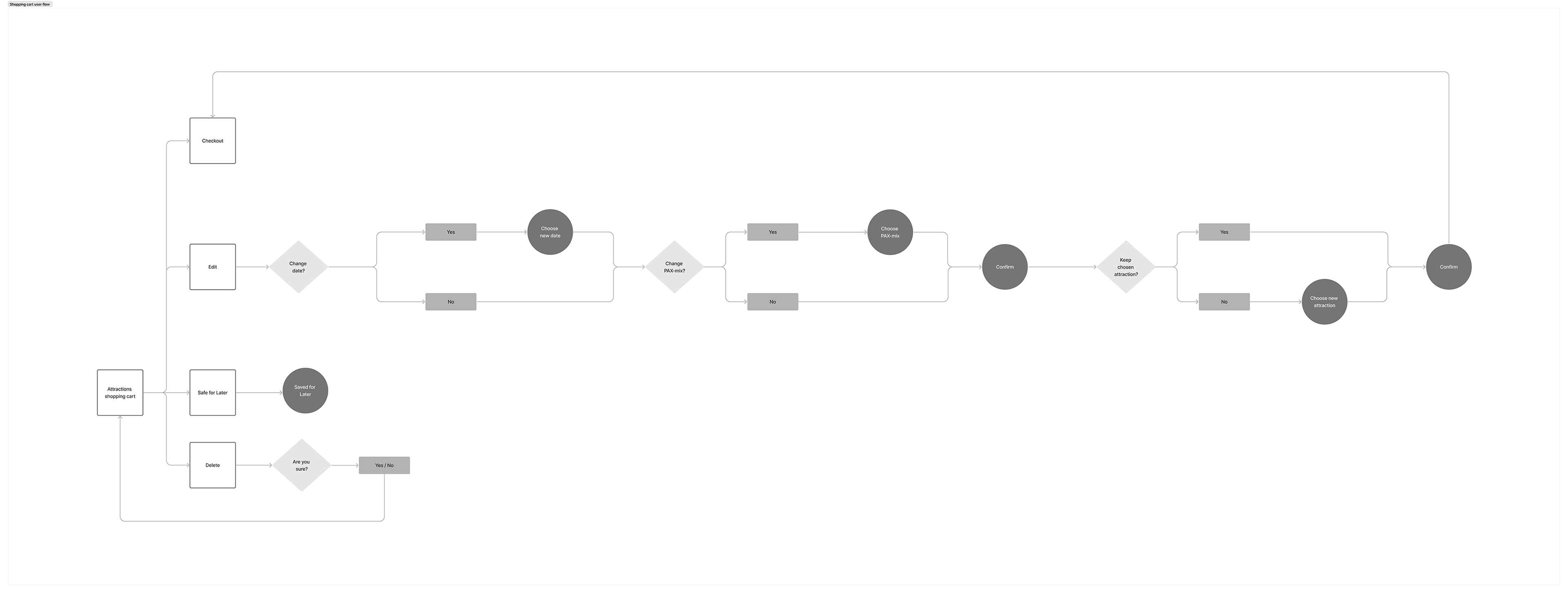
Flow Definition
We categorized user flows into two groups: non-user dependent and user-dependent. Our focus was on the user-dependent flows, which included edits that could be made based on user preferences, such as changing dates, adjusting the PAX-mix (group size), or modifying the tour grade.
Non-user-dependent: Cart interactions like checkout and payment.
User-dependent: Editable elements like dates, group sizes, and tour grades.
Wireframes & testing
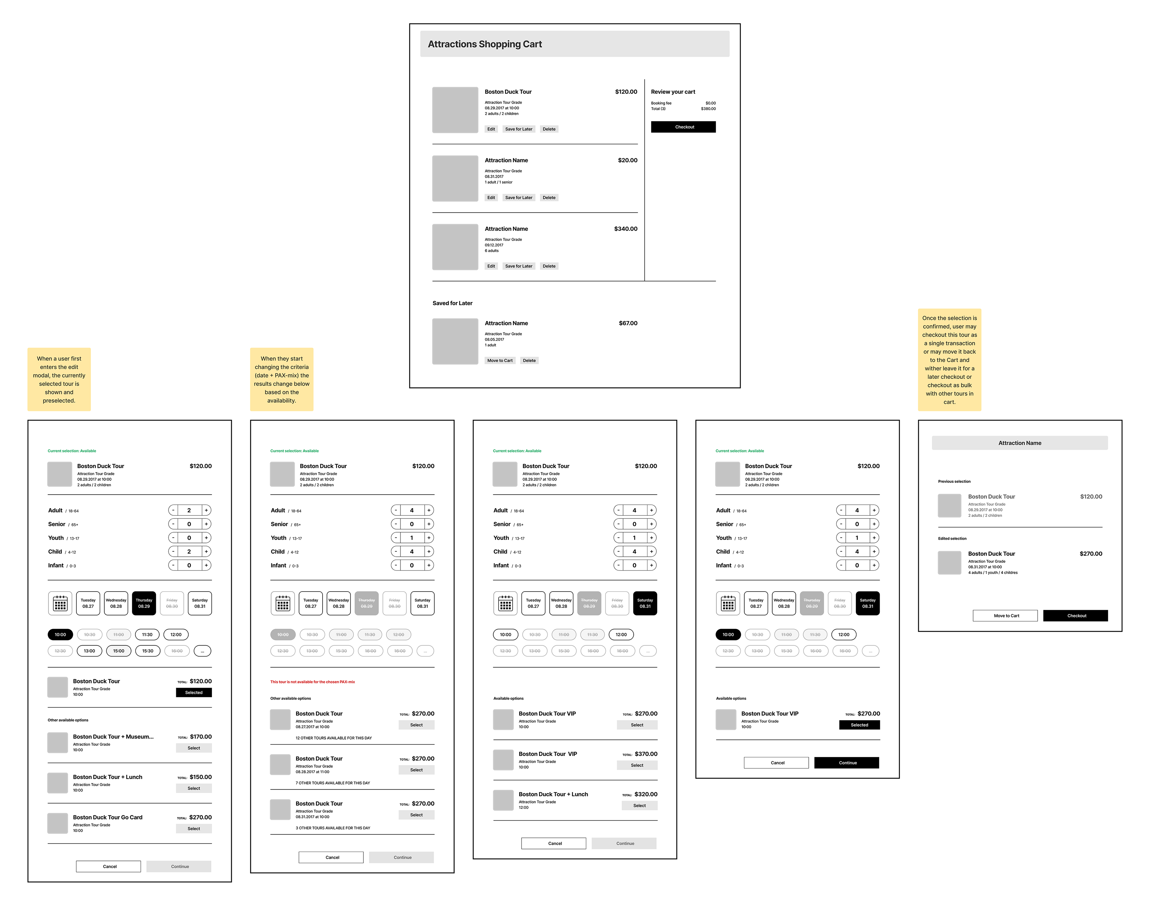
Our first wireframes featured a tabbed interface to toggle between date and PAX-mix. However, usability testing revealed this caused friction — users struggled when attractions were unavailable or dates were missing. Based on feedback, we simplified the flow by eliminating tabs and using dynamic selectors instead.
outcome

• Prototype testing validated our changes and confirmed that the editing feature met user expectations across multiple use cases.
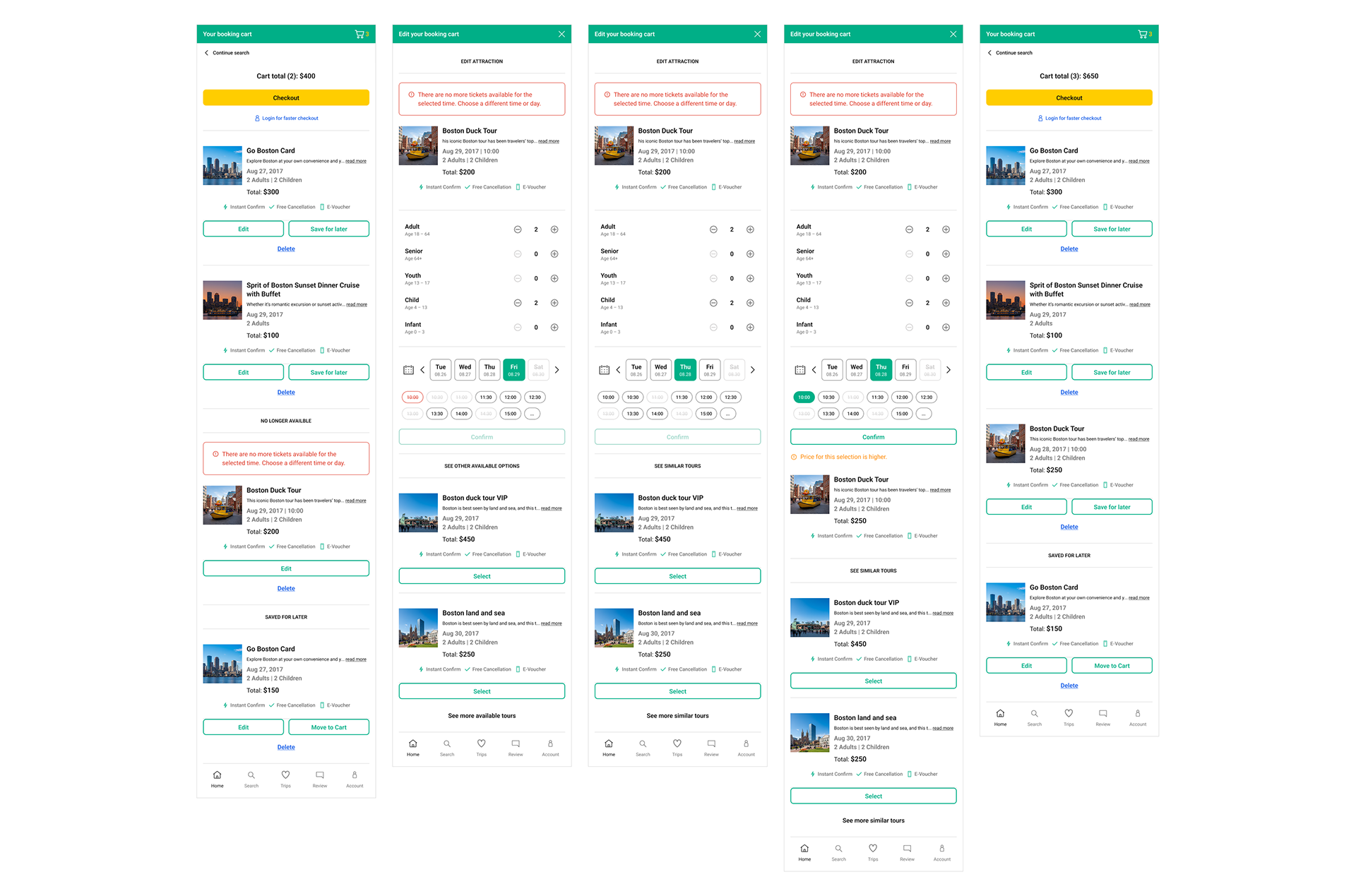
• The cart editing feature allowed users to tap directly on any cart item to enter an edit flow, make changes using the same selection interface as initial booking, and review a clear impact summary before confirming.
• The design reused existing interaction patterns for familiarity, while adding a new 'change review' layer that made the edit feel safe and reversible.
• Cart abandonment rate dropped measurably following launch, with the edit flow cited in user feedback as a key reason for completing bookings.
• Support requests related to post-booking corrections decreased.
Reflections & Growth

This project was a valuable exercise in user-centered design, iteration, and cross-team collaboration. By embracing user feedback and maintaining an agile, collaborative process, we delivered a feature that truly met user needs and drove business impact. This experience further strengthened my belief in thoughtful iteration, strategic research, and designing solutions that scale across platforms and user segments.
Scoping this project tightly to the most common edit scenarios (passenger count and date changes) was the right call, and it's a decision I'd make again. It let us ship something solid and learn from real usage before tackling the more complex edge cases. The temptation to solve everything at once is real, especially when the edge case matrix is large, but it rarely leads to better outcomes.