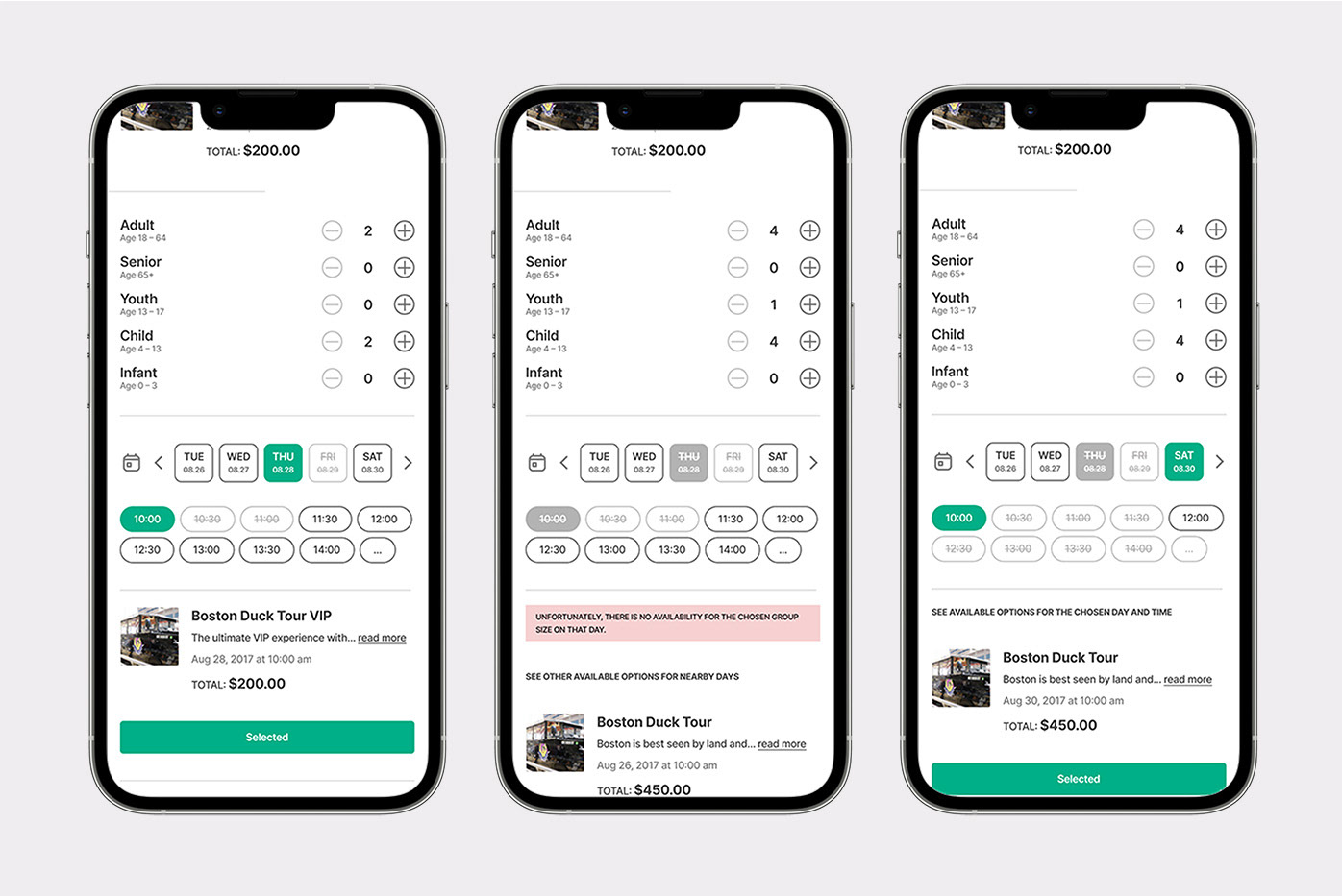
flight checkout flow
Checkout flow experience for a corporate travel app, integrating spend management (budgets, virtual cards, company policies, etc.) into an existing booking flow.
Client: Lola Travel and Expenses
Role: Lead Product Designer
Platform: iOS & Android
context

Lola is a business travel and spend management platform for small and mid-sized companies. Employees use it to book flights, hotels, and rental cars for both business and personal trips, while finance teams and admins use it to set policies, manage budgets, and control how company money gets spent.
The platform originally launched as a travel booking app. Spend management, including virtual cards, budgets, and policy enforcement at the point of purchase, was added later as a core product expansion. My job was to integrate these two worlds seamlessly: the booking experience users already knew, and the new financial layer their companies now required.
My role
Solo designer on this project, owning the problem end-to-end. I mapped the full decision tree of budget and payment scenarios, defined the information architecture and interaction patterns, and worked directly with engineering and the PM to validate feasibility across every edge case. Beyond this feature, the checkout pattern I established became the design template adopted for hotel and car rental bookings, extending the impact of this work across the platform.
problem space

The checkout flow existed and worked for basic bookings. But with the introduction of spend management, it needed to do significantly more: present the right budget options for a given trip, surface virtual cards tied to those budgets, enforce company travel policy, and handle a range of edge cases (expired cards, insufficient card limits, budgets with no eligible payment method, etc.) without overwhelming or blocking the user.
The risk was high in both directions. Too much friction and frequent travelers would abandon or work around the system. Too little clarity and employees would make out-of-policy bookings that created headaches for finance teams. The checkout had to be both fast and smart.
Key problems to solve:
• Surfacing the right virtual card for the right budget without presenting every card on file and creating decision paralysis.
• Making the 'Traveling for business?' toggle meaningful. It needed to unlock the full expense layer for business trips while keeping the flow clean for personal ones.
• Handling unavailable cards gracefully. Expired cards, insufficient limits, and budget mismatches each needed a clear explanation and a path forward.
• Keeping the flow fast for frequent travelers who already knew their preferences and just needed to confirm, not re-educate themselves every time.
• Balancing policy enforcement with user autonomy. The system needed to guide without blocking and explain without lecturing.
Approach

As the sole designer on this project, I owned the problem end-to-end, from mapping the full decision tree of budget and payment scenarios to defining the interaction patterns and shipping final specs to engineering.
I started by mapping every possible state the checkout could be in: business trip vs. personal, single budget vs. multiple, card available vs. unavailable, policy met vs. policy exceeded. This exercise surfaced just how many edge cases existed and made clear that the payment section, not the flight selection or traveler details, was the real complexity to solve.
From there, I worked through the information hierarchy. The insight that shaped the design was this: users don't need to see all their cards. They need to see which cards are valid for this specific booking, and why. That reframe led directly to the available / unavailable card distinction that became the core of the payment UI.
I ran multiple rounds of review with the product manager and engineering team as I worked through the states, pressure-testing the logic and making sure edge case handling was both technically feasible and genuinely helpful to the user.
Design decisions:
• 'Traveling for business?' toggle as the gateway: flipping it on reveals the full expense layer (budget, policy, category, expense tags) while keeping the flow minimal for personal trips.
• Budget selection drives card availability. When a user selects a budget, the payment section immediately reflects which cards are eligible for that budget, reducing cognitive load at the payment step.
• Available and unavailable cards presented in the same view, clearly separated so users can see why a card isn't usable (insufficient funds, policy restriction, expiry) without having to navigate away to find out.
• Each unavailable card includes an inline reason and a direct action ('Go to card details' or 'Contact admin') so users are never left stuck without a next step.
• Remaining spend shown alongside each card, giving users the context they needed to choose confidently without having to mentally track budget math themselves.
• Empty state for 'no eligible card' surfaces actionable options inline: add a credit card, use a different budget, or contact admin.
solution

The redesigned checkout unified the booking and expense layers into a single, scrollable flow. At the top, flight details and traveler information; in the middle, the expense section gated by the business travel toggle (budget, policy, category, and optional expense tags); at the bottom, a payment section that responded dynamically to the selected budget.
The payment section was the heart of the design. It presented available cards with remaining spend at a glance, unavailable cards with plain-language explanations and clear recovery paths, and an empty state that gave users concrete options rather than a wall. Every card state was handled: available, selected, unavailable due to insufficient funds, unavailable due to policy, unavailable due to expiry, and no card available at all.
For frequent travelers, the flow supported fast completion: sensible defaults, pre-selected budgets and cards where the system had enough context, and a minimal number of required steps for straightforward business bookings.
outcome

• The checkout pattern successfully absorbed the spend management layer without requiring a full rebuild. Existing users experienced it as a natural evolution of the flow, not a new product.
• The available / unavailable card model and budget-driven payment logic proved robust enough to scale: the same pattern was adopted for hotel and car rental checkouts in the following product cycles, validating the design as a reusable system rather than a one-off solution.
• Edge case handling, particularly the unavailable card states, reduced reliance on admin support for payment-related booking issues, as users now had clear self-service paths rather than dead ends.
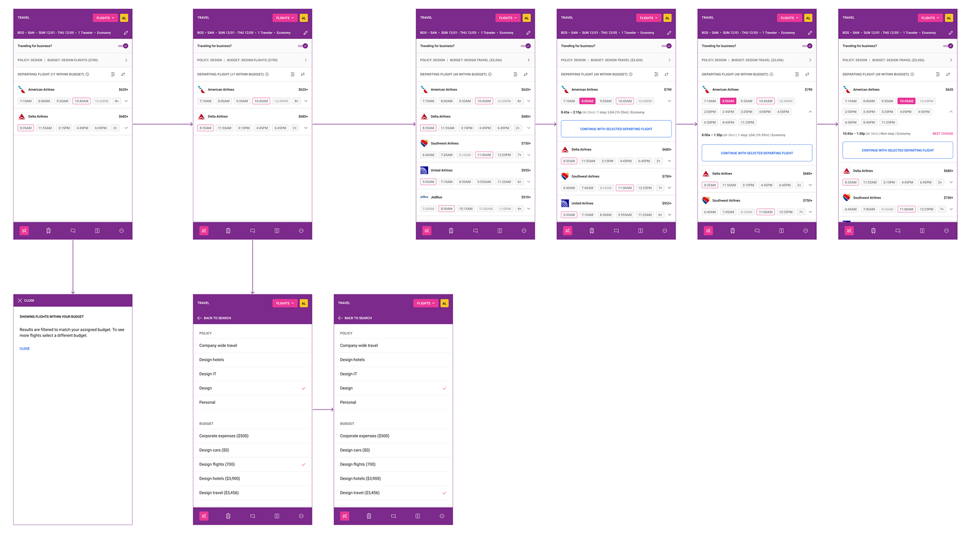
Budget-filtered search results
The search results screen surfaces flight options filtered to the traveler's active policy and budget, both shown persistently in the header bar. When the filter is active, a 'Showing flights within your budget' tooltip explains the behavior and lets the traveler know they can select a different budget to see more options. As the traveler switches their budget (from Design Flights to Design Travel, for example), the available results and price ceiling update accordingly. Once a time is selected for the departing flight, a 'Continue with selected departing flight' CTA appears inline, advancing the traveler to return flight selection.
Checkout form and expense detail selection
The main checkout screen consolidates flight details, traveler information, loyalty program, and the full expense section in one scrollable view. With 'Traveling for business?' toggled on, the budget, policy, category, and expense tag fields appear, each labeled as required or recommended.
Tapping any expense field opens a dedicated full-screen selection view: 'budget' lists all available budgets with the current selection checked, 'policy' lists all company travel policies with the active one marked, 'category' shows travel types (Flights, Hotels, Cars) without a pre-selected default so the traveler makes an explicit choice, and expense tags allow up to three selections from a predefined list with an option to add a custom tag. Each selection routes back to the main checkout form.
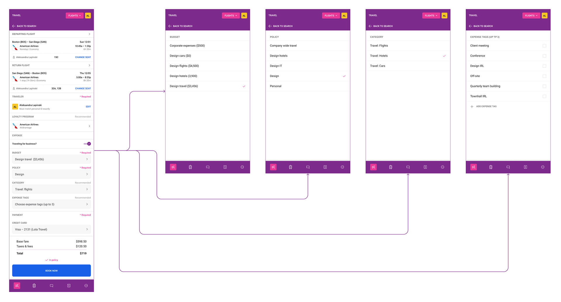
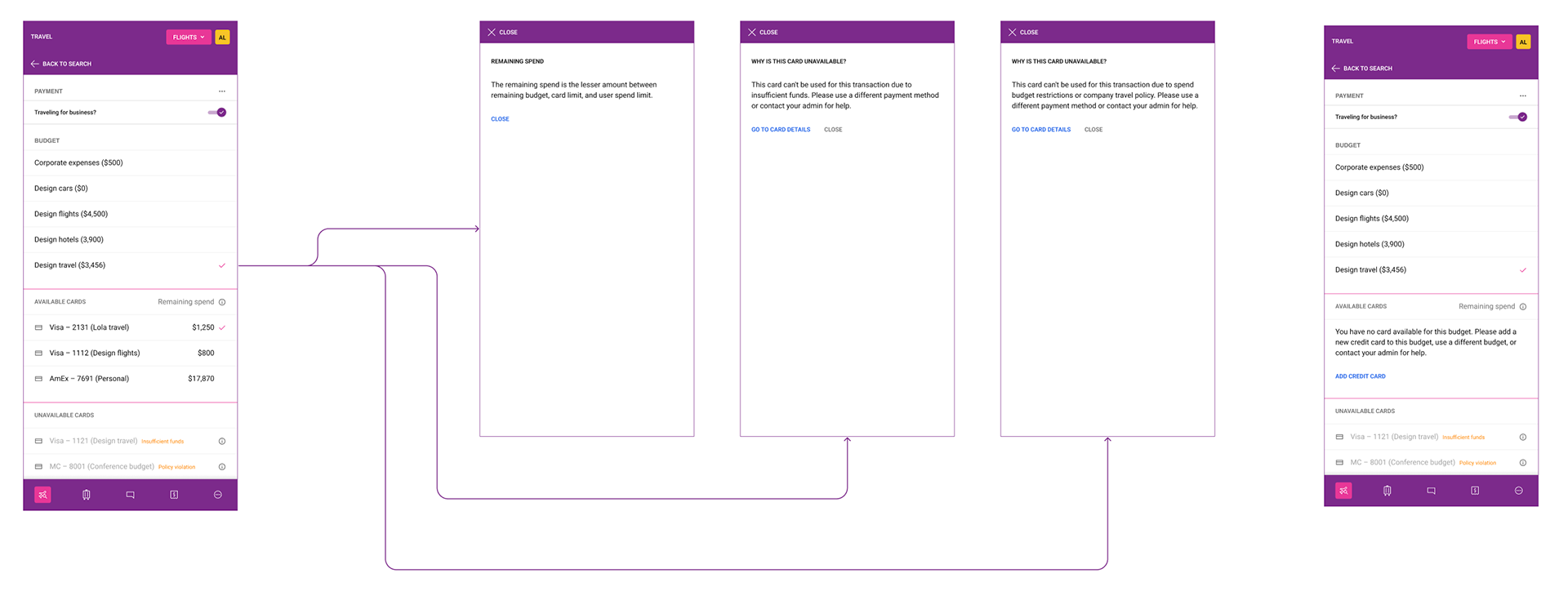
Payment section — available cards, unavailable cards, and no eligible card
The payment section organizes cards into two groups separated by a clear divider. Available cards show their remaining spend (the lesser amount across remaining budget, card limit, and user spend limit, explained via an info tooltip), with the currently selected card marked by a checkmark. Unavailable cards appear below in a muted style with an inline reason tag: 'Insufficient funds' or 'Policy violation'. Tapping the info icon on either opens an overlay explaining in plain language why the card cannot be used, with a 'Go to card details' link.
The right side of this flow shows the edge case where the selected budget has no eligible card at all. Rather than an error, the available cards section displays a plain-language explanation and a single 'Add credit card' action link, while the unavailable cards remain visible below for reference.
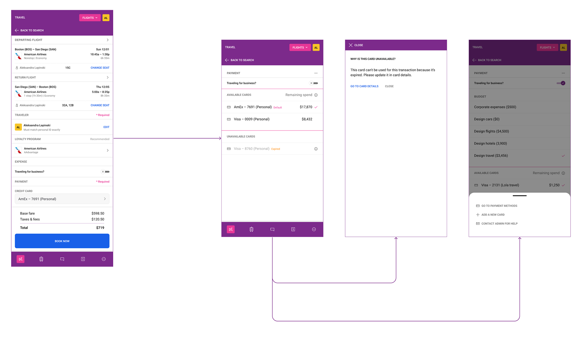
Personal trip checkout and expired card state
When 'Traveling for business?' is toggled off, the checkout collapses to show only personal payment options, with no expense fields visible. Available personal cards are listed with remaining spend and the default card marked. An expired card appears in the unavailable section with an 'Expired' label, and tapping its info icon opens an overlay explaining the card cannot be used because it is expired, with a direct 'Go to card details' link to resolve it.
The right screen shows a way to view more options: a bottom sheet surfaces three paths — go to payment methods, add a new card, or contact admin for help.
lesson learned

The most valuable thing I did on this project was map every possible checkout state before designing anything. It felt slow at the time, but it meant that by the time I started designing screens I already understood the logic completely. There were no surprises in engineering review because the edge cases had already been worked through. That approach of 'map first, design second' is now standard in how I approach complex flows.
If I were to revisit this project, I would invest more in testing with finance admins rather than just travelers. The checkout was designed primarily from the traveler's perspective, and while the policy and budget logic was sound, I suspect admins had different mental models about how cards and budgets should relate that we didn't fully surface. That perspective would have strengthened the edge case handling in particular.